
Why data visualization is important and how it helps business to make smarter decisions?
Posted by: Dr. Tamilselvi | Business Analyitics
Data Visualization is an important component and a perfect procedure for the accomplishment of an organization’s success in today’s uncertain market. Visualizing data using the right methods can provide insights which the decision makers can incorporate in their decision-making pipeline in order to make informed decisions which are driven by data.
Data Visualization Template
Benefits of Data Visualization for your Business
- To share insights
- To put complex data into a graphical format, enabling to understand information quickly
- To analyze and validate data
- To understand how to strategize subsequent steps
- Capturing the viewer’s attention and keeping them engaged throughout the storytelling
- Reduced cost
- Better customer service
CASE STUDY
African Mobile Profitability Analysis
You are a Data Consultant brought in by African Mobile, a mobile company that aggressively expanded across the entire continent of Africa beginning in 2017. Business has been humming along for the past four years, and they would like you to conduct a profitability analysis of their business. This will involve looking at not only the profitability, but also the salesperson performance.
African Mobile has requested the following:
1. An interactive dashboard showing Profit by City, tied to Profit by Segment and a Profit Trend. African Mobile should be able to select a City on the map and see the other charts and adjust accordingly. Affrican Mobile Profit Data Visualization
YEAR WISE PROFIT:
The year wise profit shows an increasing trend from year 2013 to 2014 with an increase from a loss of 766.3 to 141.6 in profit while there is a decrease in profit in the year 2015, which is however increasing during the year 2016.
PROFIT SEGMENT:
The profit segment shows that the segments are facing losses with commercial segment having a total loss of 481.7 and public and residential segment shows a loss of around 350.
CITY WISE PROFIT:
1. The maximum profit is generated from Kigali, Rwanda of 180 and the maximum loss depicted through the maroon shade is incurred in Antananarivo of 700.
2. Interactive scatterplots showing the relationship between Profit and Sales by Region, Country, or City, depending on their choice.
African Mobile City Wise Country Wise Data Visualization
The city wise scatter plots shows the relationship between profit and sales depict the amount of sales and profit each city makes, so we can say that Kigali is performing well, since it is able to generate a profit of 181 out of its sales 2584. While Harare is not able to generate good amount of profit from its sales of 8756 incurring a loss of 350.
Country wise sales show that Mauritius is able to generate a profit of 104 with a sales of 1486, while the county is generating a loss of 134 with a sales of 9504.
The region wise sales depicts that the western region is able to generate a profit of 66 out of the sales of 16116; however the eastern region is incurring a loss of 739 with a total sales of 25238.
3. An interactive salesperson analysis showing contracts sold by each person, as well as showing a difference from a selected salesperson.
Salesperson Performance Data Visualization
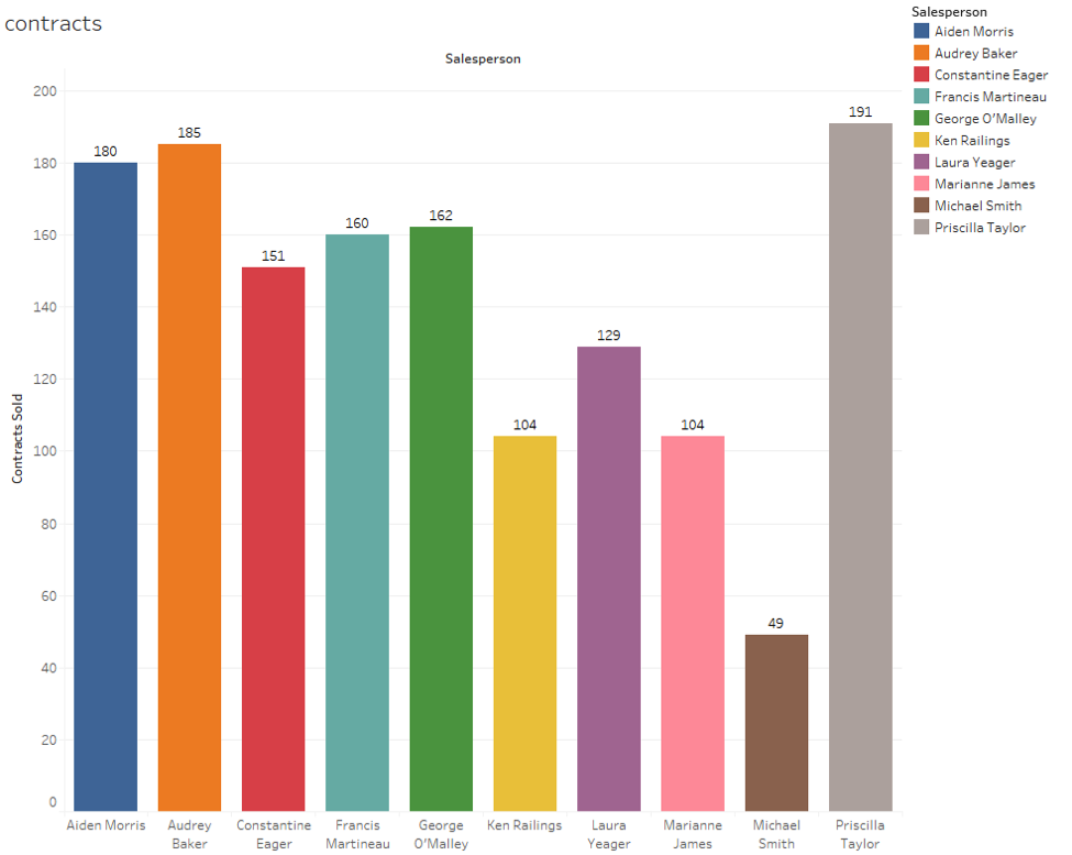
Based on the visualised sales person data, we can say that Priscilla Taylor is performing better than all other salespeople with the number of 191 contracts sold.